Click to get information about our services.
CSS Grid is a modern web design tool. It allows easy creation of website layout. It is used to position and align elements on a web page. Using CSS Grid, it becomes much easier to create more complex and functional designs.
Using Grid in CSS
CSS Grid is a powerful tool in modern web design. Web designers can create complex layouts simply and fluidly using the CSS Grid system. This article will explain how to use the CSS grid system and some tips when optimizing for SEO.
What are the Advantages of the Grid System?
There are many advantages to using the CSS Grid system. Firstly, it improves the user experience for site visitors. Thanks to the grid system, designs look more organized and clear. In addition, web pages created with the Grid system are displayed perfectly on devices with different resolutions.
How to Use the Grid System?
The grid system allows designers to achieve modern, striking and fully customizable designs. CSS Grid is used to position and align elements on a web page. This is a simple process that requires a few steps.
Determining Grid Container and Contents
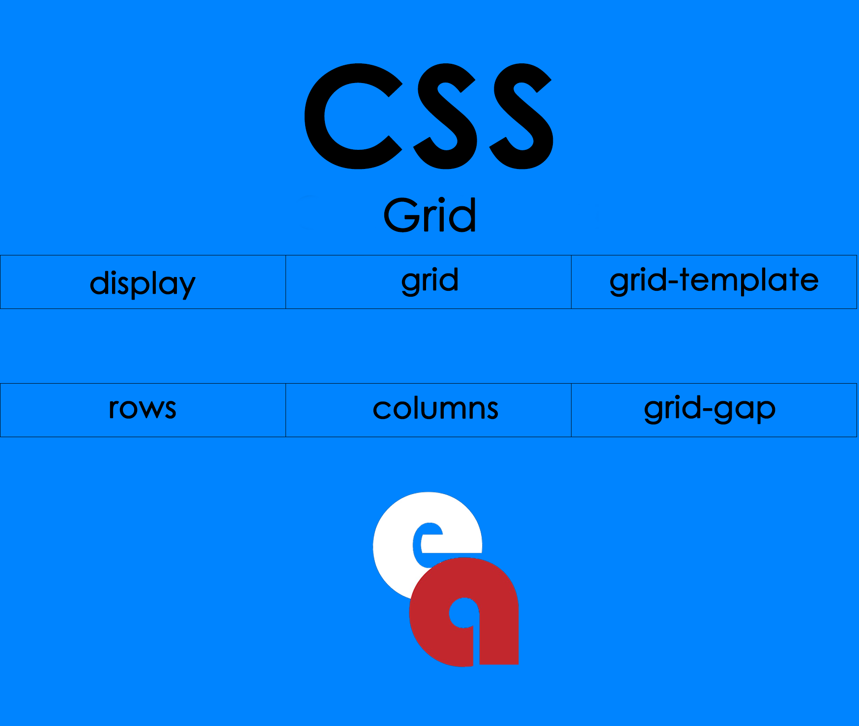
The grid system offers the ability to layout elements in many different ways. However, all grids must contain a grid container for one or more items. A specific area is defined in the grid container where most of the items will be placed or arranged. To do this, the grid-area, grid-template-columns or grid-template-rows attribute is added to the container tag.
How to Position Grid Items?
How grid items will be positioned in the box is determined primarily by the grid-template-areas property. This property determines which regions within the box will be occupied by different elements. The positions of grid items can be manipulated with the grid-row-start, grid-row-end, grid-column-start and grid-colum-end properties.
Adjusting the Spaces Between Grid Items
The grid system and the spaces separating the elements from each other make the content appear more readable and organized. These gaps can be adjusted with the CSS Grid properties grid-column-gap and grid-row-gap. Making Responsive Design with Grid System
Web pages created with the Grid system are displayed perfectly on devices with different resolutions. To ensure this, grid systems suitable for responsive design have been developed. Websites can switch to grid styles of different sizes using CSS media query.
HTML and CSS Code Example with Grid System
HTML
<div class="container">

<div class="item1">Item 1</div>
<div class="item2">Item 2</div>
<div class="item3">Item 3</div>
<div class="item4">Item 4</div>
<div class="item5">Item 5</div>
<div class="item6">Item 6</div>

</div>
CSS
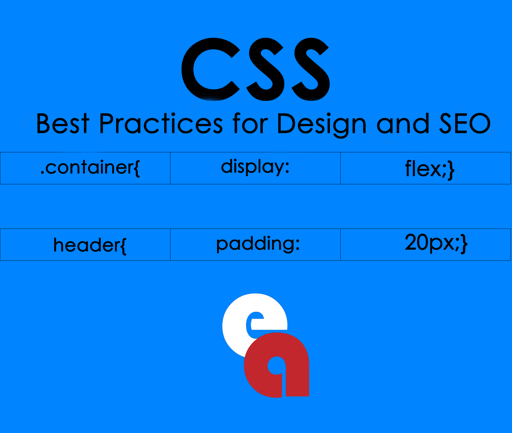
.container {
  display: grid;
  grid-template-columns: 1fr 1fr 1fr;
  grid-template-rows: 100px 100px 100px;
  grid-gap: 10px;
}

.item1 {
  grid-column: 1 / 3;
  grid-row: 1;
}

.item2 {
  grid-column: 3;
  grid-row: 1 / 3;
}

.item3 {
  grid-column: 2;
  grid-row: 2 / 4;
}

.item4 {
  grid-column: 1;
  grid-row: 3;
}

.item5 {
  grid-column: 2;
  grid-row: 4;
}

.item6 {
  grid-column: 3;
  grid-row: 4;
}
How to Perform SEO Optimization with Grid System?
CSS Grid is an important factor for the SEO of websites. A well-designed grid system can help the site rank better in search engines. For this, it is necessary to pay attention to the following tips:
- Organizing the Grid Layout correctly increases the readability of your site.
- Using keywords in the first lines of the page helps search engines understand the page better.
- Fast loading of the page is important for user experience.
- When using CSS Grid, removing unnecessary codes increases the speed and performance of the site.
Things to Consider When Using a Grid System
The grid system is a great tool in web design, but there are a few things to consider when using it:
- It is of great importance to set the grid template correctly.
- If the grid styles displayed on different devices need to be of different sizes, responsive design should be made.
- Pixel based sizing should be avoided.
- Checking browser compatibility ensures that the site displays properly on every platform.
CSS Grid is a powerful tool that can be used in modern web design. The grid system offers a user-friendly, optimized, modern design. This article explained how to use CSS Grid and ways to optimize for better SEO. Understanding the advantages and disadvantages of the grid system is an important part of strategic decisions for web design.