Click to get information about our services.
In today's web world, many different web page designs are created using CSS (Cascading Style Sheets). There are different methods such as inline, block and float solutions. However, the use of CSS flexbox has become popular in recent years. In this article, examples of CSS flexbox usage will be examined.
I. What is Flexbox?
Flexbox, as a module in CSS, enables the distribution of items in a container to be organized. In this way, many different features such as vertical and horizontal alignment, content spacing, item sizes, ordering and even the size of the container can be controlled. One of the biggest advantages of Flexbox is that responsive design can be easily created.
II. Flex Container
Flex container is the main box where the items are placed. This container has a feature that allows the use of flex units on it. This feature is determined as display. Additionally, many other features among the main features can be specified for the container.
III. Flex Item
Flex items are elements located in flex containers. These are determined by features such as the alignment, size, order and location of the container. Each flex item can be sorted in a container and equipped with more than one feature.
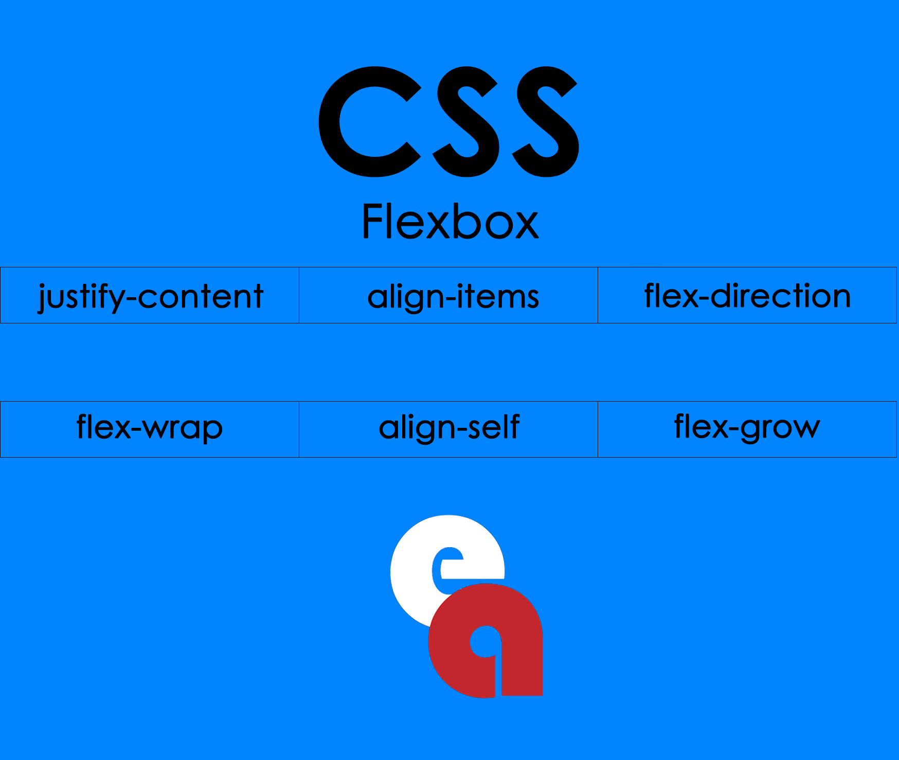
IV. Flexbox Features
When using Flexbox, there are some features used to place items. The main ones are:
- justify-content:Horizontal placement
- align-items:Vertical placement
- flex-direction:Order direction of items
- flex-wrap:Wrap feature of items
- align-self:Specific vertical alignment for any item
- flex-grow:Growth rate of items
- flex-shrink:The shrinkage rate of items
- flex-basis:Default size of items
V. Flexbox Applications
Flexbox has many different areas of use. For example;
- In editing page parts such as header, footer and left menu
- Aligning product boxes
- Aligning input elements side by side
- Mobile compatible designs such as hamburger menu
- For arranging corrugated sheets
- Effective use to increase the visibility of Cartesian products
CSS flexbox is among the indispensable parts of modern web design. Thanks to the advantages it offers, especially for responsive designs, it is frequently used in many web page designs today. In this article, examples of CSS flexbox usage are explained through basic concepts such as flex containers and flex items.